Games
ronan's graphic works
Moderator: JC Denton
ronan's graphic works
![]() by ronan » 24 Jun 2009 22:42
by ronan » 24 Jun 2009 22:42
This thread contains the headers and logos I make for this site, in order for Alex to find them more easily, and for you to give comments and suggestions.
Last edited by ronan on 27 Jun 2009 17:27, edited 3 times in total.
-

ronan - Insomnia Staff
- Joined: 12 Mar 2009 22:06
- Location: Switzerland
![]() by ronan » 24 Jun 2009 22:44
by ronan » 24 Jun 2009 22:44
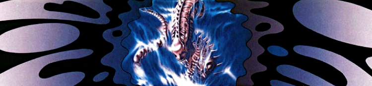
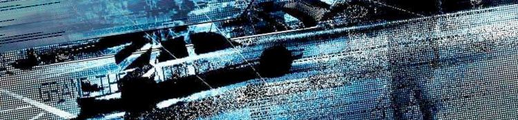
HEADERS WITH LOGO
SONIC THE HEDGEHOG 2

CYBORG JUSTICE

KAGE NO DENSETSU -THE LEGEND OF KAGE 2-
added logo

CONTRA: THE HARD CORPS
current

proposal

TEAM FORTRESS 2

SOUKOU KIHEI VOTOMS
current

rejected

KETSUI: DEATH LABEL
added logo

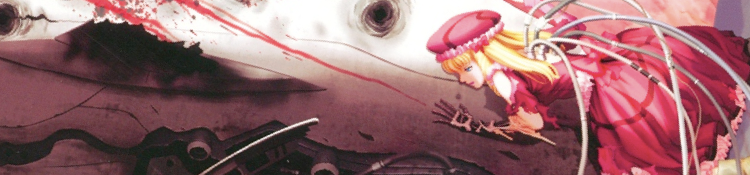
HALF-LIFE

DEUS EX

METAL SLUG

RASTAN SAGA
rejected because of suckage =D

HERZOG ZWEI

FFXII
added logo

NEW SUPER MARIO BROS

MAX PAYNE

added logo


SONIC THE HEDGEHOG 2
CYBORG JUSTICE
KAGE NO DENSETSU -THE LEGEND OF KAGE 2-
added logo
CONTRA: THE HARD CORPS
current
proposal
TEAM FORTRESS 2
SOUKOU KIHEI VOTOMS
current
rejected
KETSUI: DEATH LABEL
added logo
HALF-LIFE
DEUS EX
METAL SLUG
RASTAN SAGA
rejected because of suckage =D
HERZOG ZWEI
FFXII
added logo
NEW SUPER MARIO BROS
MAX PAYNE
added logo
Last edited by ronan on 20 Jul 2011 22:11, edited 34 times in total.
-
ronan - Insomnia Staff
- Joined: 12 Mar 2009 22:06
- Location: Switzerland
![]() by ronan » 24 Jun 2009 23:10
by ronan » 24 Jun 2009 23:10
HEADERS WITHOUT LOGO
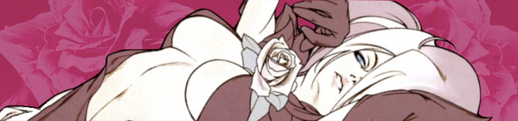
DEUS EX

PLANESCAPE: TORMENT

FAR CRY

DEAD RISING

MASTER OF MAGIC

MAX PAYNE
rejected?

R-TYPE
rejected

GEARS OF WAR

GEKKA NO KENSHI 2

KILLER 7

STREET FIGHTER III: THIRD STRIKE


MONKEY ISLAND

ACCENT CORE


STARCRAFT

DDP: DOJ BL
IBARA
SHIN SAMURAI SPIRITS

CIVILIZATION

GRAND THEFT AUTO 3
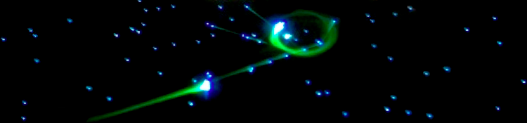
SPACEWAR!
DEUS EX
PLANESCAPE: TORMENT
FAR CRY
DEAD RISING
MASTER OF MAGIC
MAX PAYNE
rejected?
R-TYPE
rejected
GEARS OF WAR
GEKKA NO KENSHI 2
KILLER 7
STREET FIGHTER III: THIRD STRIKE
MONKEY ISLAND
ACCENT CORE
STARCRAFT
DDP: DOJ BL
IBARA
SHIN SAMURAI SPIRITS
CIVILIZATION
GRAND THEFT AUTO 3
SPACEWAR!
Last edited by ronan on 24 Jul 2011 21:30, edited 26 times in total.
-
ronan - Insomnia Staff
- Joined: 12 Mar 2009 22:06
- Location: Switzerland
![]() by ronan » 24 Jun 2009 23:10
by ronan » 24 Jun 2009 23:10
OTHER HEADERS
PC GAME PIRACY

TSUNEKI IKEDA INTERVIEW IN N-PRO DDP: DOJ BL DVD BOOKLET (2007)

HFD INTERVIEW IN N-PRO DDP: DOJ BL DVD BOOKLET (2007)

PC GAME PIRACY
TSUNEKI IKEDA INTERVIEW IN N-PRO DDP: DOJ BL DVD BOOKLET (2007)
HFD INTERVIEW IN N-PRO DDP: DOJ BL DVD BOOKLET (2007)
Last edited by ronan on 20 Mar 2010 18:03, edited 7 times in total.
-
ronan - Insomnia Staff
- Joined: 12 Mar 2009 22:06
- Location: Switzerland


![]() by ronan » 24 Jun 2009 23:32
by ronan » 24 Jun 2009 23:32
SYSTEM LOGOS
To be put on the left of the Insomnia logo. The system logos and the Insomnia logos all have the same height of 60 pixels, with 10-pixel black margin at the top and at the bottom. The system logos should be as big as possible within limits of 40 pixels in height and 80 pixels in width. There is no right nor left margin.
ARCADE


CUSTOM

WEB-BASED

NINTENDO


SEGA


SNK


NEC

SONY


MICROSOFT


AMIGA (old logo)

SHARP

PC


To be put on the left of the Insomnia logo. The system logos and the Insomnia logos all have the same height of 60 pixels, with 10-pixel black margin at the top and at the bottom. The system logos should be as big as possible within limits of 40 pixels in height and 80 pixels in width. There is no right nor left margin.
ARCADE
CUSTOM
WEB-BASED
NINTENDO
SEGA
SNK
NEC
SONY
MICROSOFT
AMIGA (old logo)
SHARP
PC
Last edited by ronan on 09 Mar 2011 14:40, edited 64 times in total.
-
ronan - Insomnia Staff
- Joined: 12 Mar 2009 22:06
- Location: Switzerland
![]() by icycalm » 25 Jun 2009 02:00
by icycalm » 25 Jun 2009 02:00
The Deus Ex header is awesome, I added it to the frontpage folder. If you can throw a logo on it I'll use that for the review page.
I see we also already have a PC Engine logo, so we can use that for Recap's Ys review if making a CD-ROM2 logo proves too difficult.
Awesome work overall. I've no idea what I would have done without all this stuff. Thanks, man.
I see we also already have a PC Engine logo, so we can use that for Recap's Ys review if making a CD-ROM2 logo proves too difficult.
Awesome work overall. I've no idea what I would have done without all this stuff. Thanks, man.
-

icycalm - Hyperborean
- Joined: 28 Mar 2006 00:08
- Location: Tenerife, Canary Islands
![]() by icycalm » 26 Jun 2009 00:51
by icycalm » 26 Jun 2009 00:51
Updated these two:
http://insomnia.ac/reviews/pc/half-life/
http://insomnia.ac/reviews/pc/deusex/
They look great now, but there's one minor thing about the Half-Life banner. That little white thingy at the top... Maybe you could airbrush it out? It's not very important, but it just stands out a little bit since the background is black.
Another thing, Ronan: it would be a good idea to simply make new posts with the new stuff, instead of just updating the original posts. This way I can easily see when you've got something new ready, instead of having to constantly check in case you updated the original posts. I mean you can still update the original posts if you want, but I'd rather you also replied to me... Great stuff anyway!
-
icycalm - Hyperborean
- Joined: 28 Mar 2006 00:08
- Location: Tenerife, Canary Islands

![]() by icycalm » 28 Jun 2009 21:14
by icycalm » 28 Jun 2009 21:14
Why is the Kage header 1500x350? I hope you don't do this to all the headers -- if you blow up the image and then shrink it you it degrades in quality...
The Metal Slug one is also nice, but where did you get the artwork from? Is it from Metal Slug 1?
At any rate I placed it on a rotating folder with the old header (which I also liked), so if you refresh the page a couple of times you should see both. But make sure to confirm if the art is from Metal Slug 1...
-
icycalm - Hyperborean
- Joined: 28 Mar 2006 00:08
- Location: Tenerife, Canary Islands
![]() by ronan » 29 Jun 2009 10:49
by ronan » 29 Jun 2009 10:49
Sorry for the Kage header. I had somehow unintentionally doubled the resolution, probably because of a shortcut. Anyway, it is back to normal.
I also corrected the Half-Life and Metal Slug headers: there were some ugly pixels at the border (respectively below the face and on the left).
The Metal Slug original image is from here: http://images.mslugdb.com/ms/special/index1.html. It is said to be from the first Metal Slug. I always pay attention to that, don't worry.
By the way, I am quite surprised that you like the old Metal Slug header: not only does it feature screenshots, but the art seems to come from Metal Slug X.
Last edited by ronan on 07 Jul 2009 16:51, edited 1 time in total.
-
ronan - Insomnia Staff
- Joined: 12 Mar 2009 22:06
- Location: Switzerland
![]() by ronan » 30 Jun 2009 10:04
by ronan » 30 Jun 2009 10:04
I also added the old Amiga logo, and the Famicom logo.
I was not sure about the Famicom logo, but it appears on some consoles:
http://www.obsolete-tears.com/photos/Nintendo-Famicom.jpg
I could of course make a logo that says: "FAMILY COMPUTER", but I try to avoid text in the logos. That is why I prefer to use a picture of a Game Boy Advance than its official logo (just text).
I still have to find a solution for consoles such as the Playstation 3 and the Sega Mark III. The problem is that if we want all the system logos to be 40 pixels high, so that they match the Insomnia logo, they may become extremely long. Sure, I could reduce them and put them in a 40-pixel-high frame, but I don't like this solution.
But I think it would be possible to reduce the size of such logos if we use another Insomnia logo. For example, in the attempt of an Insomnia logo that I made with an eye, the height of the logo is still 40 pixels, but the height of the text is smaller. Then it would be fine, I think, to reduce the height of the logo, so that the texts "Playstation 3" or "Mark III" and "Insomnia" match.
Last edited by ronan on 07 Jul 2009 16:55, edited 3 times in total.
-
ronan - Insomnia Staff
- Joined: 12 Mar 2009 22:06
- Location: Switzerland
![]() by ronan » 01 Jul 2009 01:03
by ronan » 01 Jul 2009 01:03
PC logos and Herzog Zwei header added.
By the way, if you intend to use the new review template for all the low-res games, maybe I shouldn't spend too much time on such headers...
By the way, if you intend to use the new review template for all the low-res games, maybe I shouldn't spend too much time on such headers...
Last edited by ronan on 07 Jul 2009 16:53, edited 2 times in total.
-
ronan - Insomnia Staff
- Joined: 12 Mar 2009 22:06
- Location: Switzerland
![]() by icycalm » 01 Jul 2009 01:25
by icycalm » 01 Jul 2009 01:25
Exactly, it's a waste of time, and I've been meaning to tell you. You are even wasting time on banners that are perfectly good (Rastan Saga) and that I never asked you to update. Anyway, I want to post many more comments in this thread and also update the site with your newer works, but am too busy trying to post the first issue of Postback EX right now (should be up within the next couple of hours, hopefully), so I'll get back to you as soon as I find a spare moment. Thanks for all the work though, I deeply appreciate it...
-
icycalm - Hyperborean
- Joined: 28 Mar 2006 00:08
- Location: Tenerife, Canary Islands
![]() by ronan » 01 Jul 2009 01:52
by ronan » 01 Jul 2009 01:52
Fine, from now on, I will wait for your requests. It's just that I disliked the old headers for Metal Slug and Rastan Saga, and since these were Videogame Art, I thought it was worth a try to improve them. I also thought that the Herzog Zwei header without logo could go on the frontpage. (Unfortunately I didn't manage to make something nicer).
Anyway, I am looking forward to the first issue of Postback EX!
Anyway, I am looking forward to the first issue of Postback EX!
-
ronan - Insomnia Staff
- Joined: 12 Mar 2009 22:06
- Location: Switzerland
![]() by icycalm » 01 Jul 2009 01:58
by icycalm » 01 Jul 2009 01:58
The Metal Slug and Herzog Zwei you made are awesome -- the Rastan one sucks though :)
I'll use those two then, and when I get around to updating the reviews to the 2D template we'll find a use for the old ones, I think. One idea is to use them for the forum threads, if I can hack the forum to accept different headers for different threads. But yeah, the best thing would be for me to make a nice long list of priorities, and then you tackle them as you see fit. I'll get back to you on this soon. Good work on the logos too. I'll give you some ideas about what to do with the ones that are giving you trouble.
I'll use those two then, and when I get around to updating the reviews to the 2D template we'll find a use for the old ones, I think. One idea is to use them for the forum threads, if I can hack the forum to accept different headers for different threads. But yeah, the best thing would be for me to make a nice long list of priorities, and then you tackle them as you see fit. I'll get back to you on this soon. Good work on the logos too. I'll give you some ideas about what to do with the ones that are giving you trouble.
-
icycalm - Hyperborean
- Joined: 28 Mar 2006 00:08
- Location: Tenerife, Canary Islands