
Games
ronan's graphic works
Moderator: JC Denton
 Viewed 16677 times")

 Viewed 16665 times")
 Viewed 16665 times")
 Viewed 16662 times")
 Viewed 16662 times")
 Viewed 16662 times")
 Viewed 16662 times")
 Viewed 16649 times")
 Viewed 16649 times")
 Viewed 16649 times")
 Viewed 16637 times")
 Viewed 16640 times")
 Viewed 16627 times")
![]() by icycalm » 12 Sep 2012 17:53
by icycalm » 12 Sep 2012 17:53
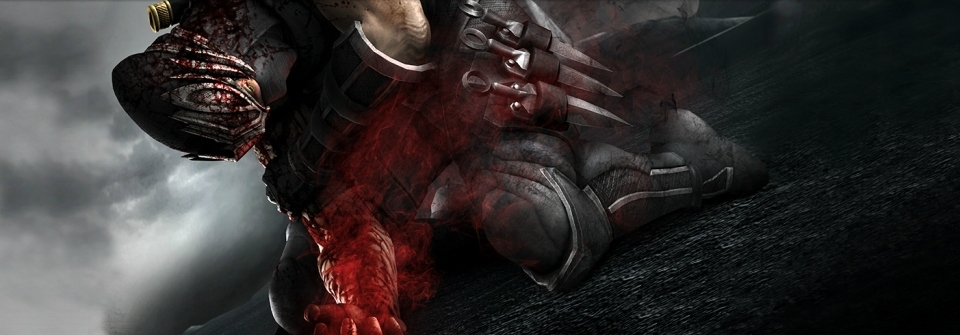
I took that image from the frontpage of the official NG3 site (I even think it was the Japanese one, if I remember correctly), so these lines do not appear to be artifacts, but somehow intended by the artist. They are very pronounced in the full-scale version of the illustration, so perhaps they have some meaning that has something to do with the game? Sounds crazy, I know, but I am reluctant to mess with it, especially considering they don't really bother me aesthetically, as all the other edits I ask you to make from time to time.
So I'll wait until I play the game, and we'll see. Thanks for the effort though.
So I'll wait until I play the game, and we'll see. Thanks for the effort though.
-

icycalm - Hyperborean
- Joined: 28 Mar 2006 00:08
- Location: Tenerife, Canary Islands
![]() by icycalm » 14 Sep 2012 22:13
by icycalm » 14 Sep 2012 22:13
Ok, I ended up saying what the hell and just updated it.
I've basically got around 90 headers now, which is quite a feat considering, and plenty for now, but there are a few that need a little touch-up before I can call it a day with this aspect of the site and move on to updating other aspects. So I'll post them here for you to take a look, and you do what you can when you can. (And don't forget when saving them to keep the size down to around 130KB max.)
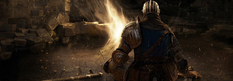
http://culture.vg/images/headers/darksouls.jpg
Some shit at the bottom-left corner that needs cleaning.
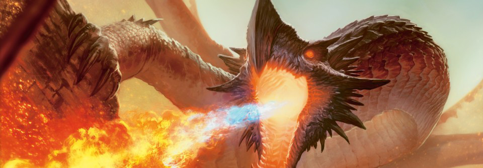
http://culture.vg/images/headers/magicthegathering.jpg
Again at the bottom-left corner there is something that looks like a little stick, which is the top part of a spear, and it needs to go. It's very small, practically tiny, but you'll see it.
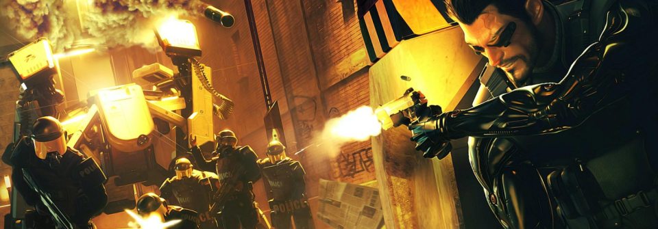
http://culture.vg/images/headers/deusex.jpg
This is a little more difficult. I want the missile/bomb thing that the cops have fired at him (at around the middle of the top of the image) to disappear along with its smoke-trail, but in such a manner so that the smoke cloud will not look butchered or anything. You'll basically have to remove just as much smoke as is necessary, but not too much.
There may be a couple more but I need to get hold of large monitor to look at all of them carefully, because the 10" laptop screen I am using is not ideal for the job.
I've basically got around 90 headers now, which is quite a feat considering, and plenty for now, but there are a few that need a little touch-up before I can call it a day with this aspect of the site and move on to updating other aspects. So I'll post them here for you to take a look, and you do what you can when you can. (And don't forget when saving them to keep the size down to around 130KB max.)
http://culture.vg/images/headers/darksouls.jpg
Some shit at the bottom-left corner that needs cleaning.
http://culture.vg/images/headers/magicthegathering.jpg
Again at the bottom-left corner there is something that looks like a little stick, which is the top part of a spear, and it needs to go. It's very small, practically tiny, but you'll see it.
http://culture.vg/images/headers/deusex.jpg
This is a little more difficult. I want the missile/bomb thing that the cops have fired at him (at around the middle of the top of the image) to disappear along with its smoke-trail, but in such a manner so that the smoke cloud will not look butchered or anything. You'll basically have to remove just as much smoke as is necessary, but not too much.
There may be a couple more but I need to get hold of large monitor to look at all of them carefully, because the 10" laptop screen I am using is not ideal for the job.
-
icycalm - Hyperborean
- Joined: 28 Mar 2006 00:08
- Location: Tenerife, Canary Islands
 Viewed 16612 times")
 Viewed 16609 times")
 Viewed 16609 times")
 Viewed 16609 times")
 Viewed 16606 times")
![]() by icycalm » 17 Sep 2012 02:19
by icycalm » 17 Sep 2012 02:19
I can't see any problems on my 10" monitor, so I uploaded it along with the rest. Except the Deus Ex one, actually. It's a good job, but I now realized that all the smoke is due to the missile, and without it makes no sense. So I'll think about that. But the rest work great, thanks. I'll have a couple more easy edits for you tomorrow, and then I'll call it a day with headers for a long time. There are so many of them now that when I upload a new one and want to check how it looks in place, I have to wait for ages until the frontpage cycles to it. Can't imagine what it will be like when I reach like 200. I guess in that case I'll have to disable some of the old ones, then check the new ones are alright, then enable the old ones again, or something
-
icycalm - Hyperborean
- Joined: 28 Mar 2006 00:08
- Location: Tenerife, Canary Islands
![]() by icycalm » 19 Nov 2012 06:31
by icycalm » 19 Nov 2012 06:31
You can now see your 360 header in the 360 mini-review thread. It looks great, and unless you make any alternates I'll be using it in every kind of 360 thread/main site page. If you do try to make any alternates, one good idea would be to have one without the name of the console. Simply with a logo or something. Because the thread title already says "Xbox 360" you see, and there's no way to remove it. On the main site, on the other hand, it will look fine because I don't have to include a title for a page if I don't want to. And the same goes for the PS3 and all the other systems. The ideal would be one header with graphics only, and another with graphics+logo.
Another request would be headers specifically for Xbox Live and for XBLA (these are two different things...) And a PC header would be nice too, though I've no idea what you could use for it... Failing any good ideas, perhaps a generic Windows one would tide me over for a while... See if you can do anything.
Another request would be headers specifically for Xbox Live and for XBLA (these are two different things...) And a PC header would be nice too, though I've no idea what you could use for it... Failing any good ideas, perhaps a generic Windows one would tide me over for a while... See if you can do anything.
-
icycalm - Hyperborean
- Joined: 28 Mar 2006 00:08
- Location: Tenerife, Canary Islands
 Viewed 16579 times")
 Viewed 16579 times")
![]() by icycalm » 21 Nov 2012 23:55
by icycalm » 21 Nov 2012 23:55
They look great. You can see them in action here:
http://culture.vg/forum/topic?f=3&t=3982
http://culture.vg/forum/topic?f=3&t=3984
http://culture.vg/forum/topic?f=3&t=3982
http://culture.vg/forum/topic?f=3&t=3984
-
icycalm - Hyperborean
- Joined: 28 Mar 2006 00:08
- Location: Tenerife, Canary Islands
 Viewed 16568 times")
 Viewed 16564 times")
![]() by icycalm » 22 Nov 2012 23:21
by icycalm » 22 Nov 2012 23:21
I prefer the first one, though I might also use the second one at some point on some other pages. You can see the first one here:
http://culture.vg/forum/topic?f=6&t=3999
The DC and XB ones you made are perfect and I'll be using them soon. Other priorities right now are a PSP one, even if it's just a plain logo, because I really don't like any of the ones you've made so far, and for the arcades and the PC. DS and GameCube ones would be nice too. I'll be posting a lot of mini-reviews for all these platforms soon, so it'd help with my motivation if the threads looked nice too. Thanks again for all the help!
-
icycalm - Hyperborean
- Joined: 28 Mar 2006 00:08
- Location: Tenerife, Canary Islands
 Viewed 16554 times")
![]() by icycalm » 23 Nov 2012 23:48
by icycalm » 23 Nov 2012 23:48
It does the job and I added it to the PSP thread, but did you try making it the same size as the PS2 one? You seem to have positioned their right edges on the same exact spot, which is great, but the PSP one is something like 20% taller. I think I prefer the size of the PS2...
http://culture.vg/forum/topic?f=6&t=3855
http://culture.vg/forum/topic?f=6&t=3855
-
icycalm - Hyperborean
- Joined: 28 Mar 2006 00:08
- Location: Tenerife, Canary Islands
 Viewed 16541 times")